4 ways to improve your creative strategy for mobile ads
March 31, 2022

Following the release of iOS 14.5, serving hyper-targeted and personalized ads on iOS is now only possible with the user’s consent to in-app tracking. Apple’s tighter privacy measures have also placed limitations on segmenting users based on their stage in the purchase funnel, engagement level, and purchase behavior.
While marketers can still design ads for specific install or reengagement campaigns, they can only use this content for users who have provided consent for both the publisher and advertiser apps on iOS. Without this permission, identifying whether a user has already installed an app is not possible and as a result, mobile ad strategies are shifting towards a more inclusive approach, which will have a significant impact on creatives.
Apple’s privacy changes do not affect Android however, meaning app marketers can still show personalized ads via retargeting campaigns on this operating system.
Best practices for Android and iOS creatives
Our creative strategy guide provides an overview of the core elements of a mobile ad. Whether you are building creatives for iOS or Android, the fundamentals of your design, copy, and marketing mechanisms remain the same. In Make it worth the click, we also look at insights and best practices for establishing a testing framework for Android and iOS ads.
In this blog, we look at 4 ways to immediately improve your creative strategy and approach to mobile ad creation.
1. Take another look at the design elements of your mobile ads
An engaging user experience is fundamental to increasing conversions and your ad’s design is a significant part of that experience. Make the user flow as seamless as possible by visually aligning the look of your ad with the next steps the user will take, whether it is a download or in-app purchase.

Fig. 1: The example on the left is a user acquisition ad. It contains visual hints of the projected next step (downloading the app on the marketplace) by showing ratings, comments, previews etc. The example on the right is a retargeting ad. It uses some recognizable UI elements from the app itself.
2. Revisit the copy elements of your ads
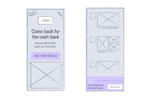
Functional and brand copy are equally important factors to consider when creating your ads. Below are two examples of how to optimize the use of space, call-to-action changes, and messaging clarity.

Fig. 2: The example on the left shows a full screen ad that makes strategic use of the available space. The CTA is direct and self-explanatory. The example on the right shows a smaller ad that belongs to the same campaign. Due to space constraints, the copy has been reduced.
3. Stay on-brand through your ad content and placement
Taking care of your app’s brand is a valuable investment, especially in a world where people make decisions within milliseconds of viewing an ad. When it comes to your creative strategy, consider these two aspects of the brand:
- Brand safety: This relates to the placement of your ad. Protect your brand by ensuring that your DSP partner excludes traffic flagged as inappropriate content.
- Brand relevance: This relates to the different elements that make up your ad creative. Include one or more elements that connect back to your app. Examples include your app logo and components such as characters, restaurants, or products.
4. Test and verify your creatives with incrementality testing
You can already begin strategically testing your creatives. When doing A/B testing, make sure to test one variable at a time and avoid multi-variant testing. By doing this, you’ll set up your learning in a way that comes with real isolated insights. For each element such as headline, the main character, main image, CTA copy, or CTA color, test up to thirty variations (wherever possible) until you’ve arrived at the best performing option.
One option for testing without the IDFA would be to test larger concepts versus a group of small iterations (a.k.a. Incremental variable testing). This has been the standard until now.
Another option for testing would be to use a science-based methodology, such as incrementality measurement, to A/B test creatives. The setup would include a three-way split that consists of one control group and two test groups, where each test group receives a different creative. The groups are created based on dimensions such as the device model, instead of the IDFA. While this would be the more accurate option to test creatives, you will need a significant campaign size to arrive at meaningful results.
Make it worth the click
Access the creatives guide


