10 lessons on how to enhance your retargeting and UA creatives
October 04, 2022

What are the steps app marketers must take when developing or improving their creative strategy for mobile ads in the privacy-first era?
We asked our partners Nate Barnes, Creative Director at InMobi, and Brian Janelli, Sr. Director, Global Creative, at AdColony - a Digital Turbine company, to share their expertise on how to build and test creatives for retargeting and user acquisition campaigns.
Nate Barnes, Creative Director, North America, InMobi

Tell a story with your brand elements
At InMobi, we’ve helped many brands tell their story in mobile advertising for the first time. We always focus on telling the brand’s story with a clear and compelling message in attractive and engaging ad formats. At the start of every campaign, our clients provide us with a creative brief, in which they’ve answered several essential questions regarding their brand, customer, and campaign objectives.
App marketers should approach their mobile ad campaigns in the same manner. They must focus on distilling their app’s value proposition into a well-branded story, targeted at a receptive audience within their most-used apps, with creatives that break through banner blindness and lead to engagement. It is extremely helpful if the client already has a brand style guide that explores these principles and documents their style, voice, and aesthetic. With these fundamentals clearly established, the creative development of the ad units in the campaign will come together very naturally.
Evoke an emotional response with your retargeting creatives
Strong branding is at the forefront of a well-executed app retargeting campaign. When re-engaging your user, it’s pivotal to immediately reconnect with that emotional connection they’ve hopefully formed with your app and brand. Personally, when I see an ad appear for a brand that I feel strongly about, I notice an emotional response, even if faint. I remember why I like using that app: how it makes me more productive, makes a hobby more enjoyable, or introduces me to new content. The goal with retargeting is to spark that vibe so your users will think to open your app again, soon.
Here are a few things app marketers can do when building retargeting ads:
- Leverage elements in your app or brand that are highly memorable or have a natural connection with the user, such as a character from a game or a unique user interface (UI) element that a user would identify with.
- Remember to use animation to grab the user’s attention, and direct it towards those high-recall elements.
- Use simple messaging to remind them of features they love or inform them of a new one.
Use rich media experiences to convert awareness into acquisition
« I think the secret to a great mobile ad is the element of surprise. »
Nate Barnes, Creative Director, North America, InMobi
A user acquisition campaign is basically a brand awareness campaign for an app. Brand awareness projects achieve the best results when they are in front of the maximum amount of eyeballs possible. As such, I would always recommend a holistic approach to campaign creatives – this includes running a mix of ad types and placements to reach maximum scale. Catering your message for each ad unit is critical, and each format has unique challenges and advantages. For instance, banners must compete for attention, but they make up for it by having huge scale and reach. People are used to skipping traditional video ads, but a well-crafted vertical video that fills a screen in the same aspect ratio as their app gets markedly higher completion rates.

When run alongside standard banners, or as a companion to video ads, a rich media experience is an amazing asset for converting awareness into acquisition. That engagement is often the tipping point that finally results in a download.
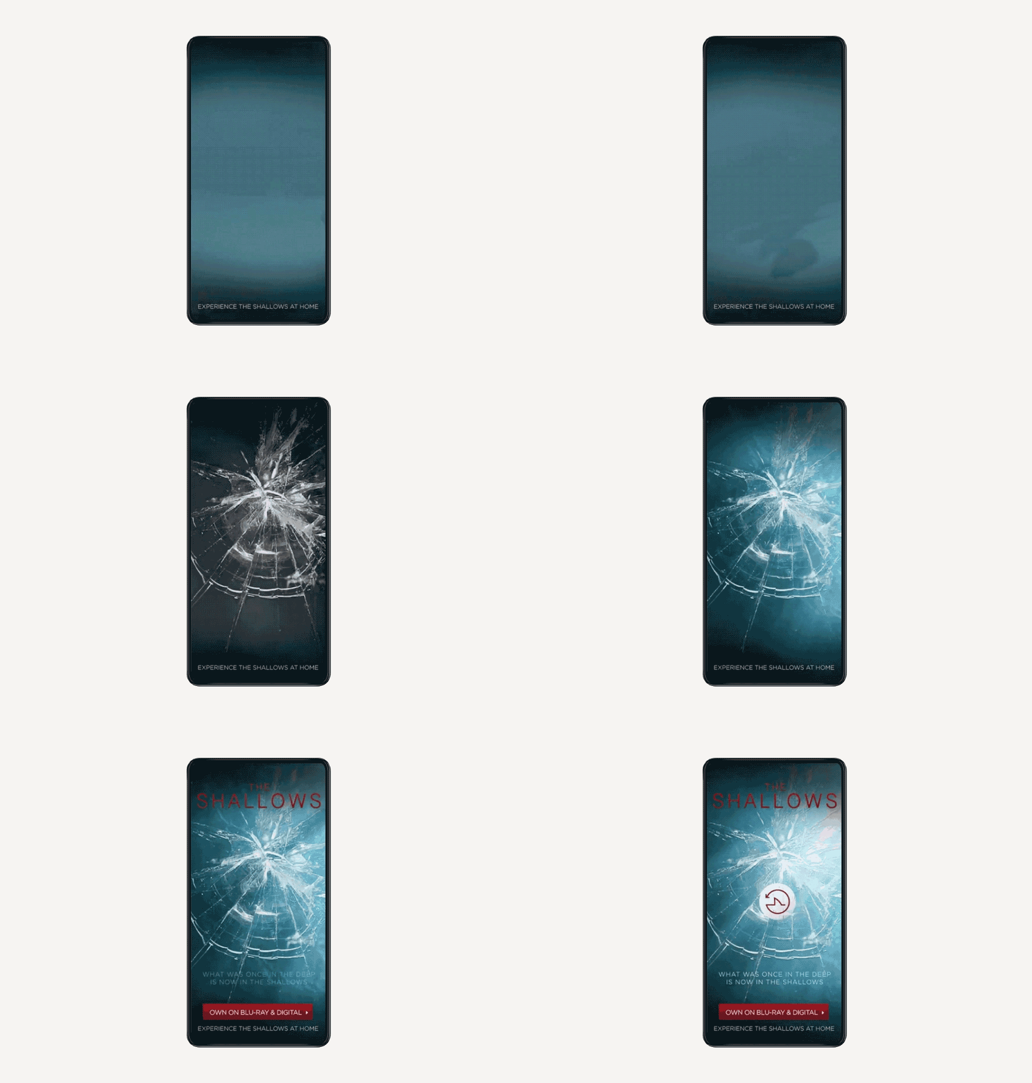
I think the secret to a great mobile ad is the element of surprise. We only have moments to grab attention and capitalize on it, so great design isn’t always enough to capture the user’s attention. My favorite example of marketing by surprise is a video interstitial we ran for Sony Pictures’ movie “The Shallows” (see below). This full-screen video presents a point-of-view perspective of a swimmer struggling in the water, immediately followed by a great white shark rushing the screen. The screen appears to shatter, while haptic vibrations shake the phone on “impact.” The shark swims away and the film’s logo and call-to-action appear, resulting in a higher click-through rate than a standard pre-roll video.

Experiment with creatives themes
In order for any scientific testing to be meaningful, there must be large test groups and many test iterations, over a sustained timeline. Ad testing is a significant time investment as companies must run ads, collect insights, adjust creatives based on assumptions, test those revisions, and repeat that cycle until the data becomes actionable. This can feel very overwhelming and sometimes counterproductive.
I feel that variety in creative and frequent creative refreshes are just as important as testing. Start with two to three strong design themes, across a variety of placements and formats, and monitor general performance. On the next iteration, remove the lowest-performing theme, and add a new one. This will prevent viewer fatigue while narrowing in on the stronger performing elements.
By creative themes, I’m referring to the distinct design elements and copy choices that compose a singular ad unit. The more distinction there is between these themes, the more useful and meaningful the testing results will be. Creative theme differences might include using a photograph instead of vector art or may entail headline changes, color choices, or call-to-action variations. The challenge is ensuring that each creative theme adheres to the brand’s style guide and maintains a cohesive appearance, as audiences will form an impression based on all of these.
Take advantage of in-game advertising
On our platform, the full-screen video interstitial reigns supreme, with the ultimate experience being the vertical video with a rich media end card. This unit combines the high render and completion rates of VAST (video ad serving template) videos with a post-completion rich media experience usually only possible via MRAID (mobile rich media ad interface definitions).
Video and rich media are the chocolate and peanut butter of mobile advertising — they’re both great separately, but exponentially better when combined. A great use case for the app marketer could be to develop a 15-second video featuring an influencer hyping their app, followed by an app store-like rich media page featuring all the familiar brand elements and a gallery of screenshots.

Another common use case would be a video of gameplay, followed by a playable unit providing the user a chance to experience the game before downloading. Video and rich media end cards are a powerful one-two punch ad unit. One of my favorite things at Inmobi is creating a rich media experience to enhance an already fantastic video that our client has created.
At InMobi, one of our most exciting new formats is in-game advertising — that is, advertising that appears organically within the gameplay, much like product placement in film and TV. This type of advertising provides repeated brand impressions without disrupting the user experience. These in-game impressions can lead to a greater conversion rate for a campaign’s standard banners, interstitials, and videos. Subtly and variety is the key to effective in-game advertising. The ad only appears briefly, so simplicity is important - while variety is important so the user doesn't get sick of seeing your ads.
Brian Janelli, Sr. Director, Global Creative, AdColony - a Digital Turbine Company

Define your goals, KPIs and measurement tactic
App marketers setting out to craft a creative mobile ad strategy must first determine the target audience, their primary KPI for the campaign, and how the campaign’s main objectives will be measured. Based on the goal(s) of the campaign, creatives can then dictate the direction and user flow of the experience itself. If marketers can collaborate with designers ahead of campaign launch to create content specifically for the ad, it almost guarantees success as great design assets usually translate to a great finished deliverable. Finally, app marketers should determine where users should be motivated to interact within the ad in order to present users with clear messaging and enforce creative best practices wherever necessary.
Understand your customer consumer personas
Designers should put just as much thought and effort into a retargeting ad as the original campaign launch. During production all stakeholders must keep in mind that consumers are exposed to so many ads on a daily basis, so a retargeting ad should feel as personal as possible, both from a layout and copy perspective.

It’s crucial to ensure the copy is a minimum of 18pt font for legibility on smaller devices, and any background imagery behind the copy should be simple enough so there’s a great amount of contrast. Creative designers should have a full understanding of the customer journey, target audience, and previous user behavior metrics to maximize conversion rates. The more comprehensive the understanding of consumer personas, the easier it will be to hone in on simplifying the design of the user journey and formulating messaging for the retargeted user.
Present the user with a clear path to the install
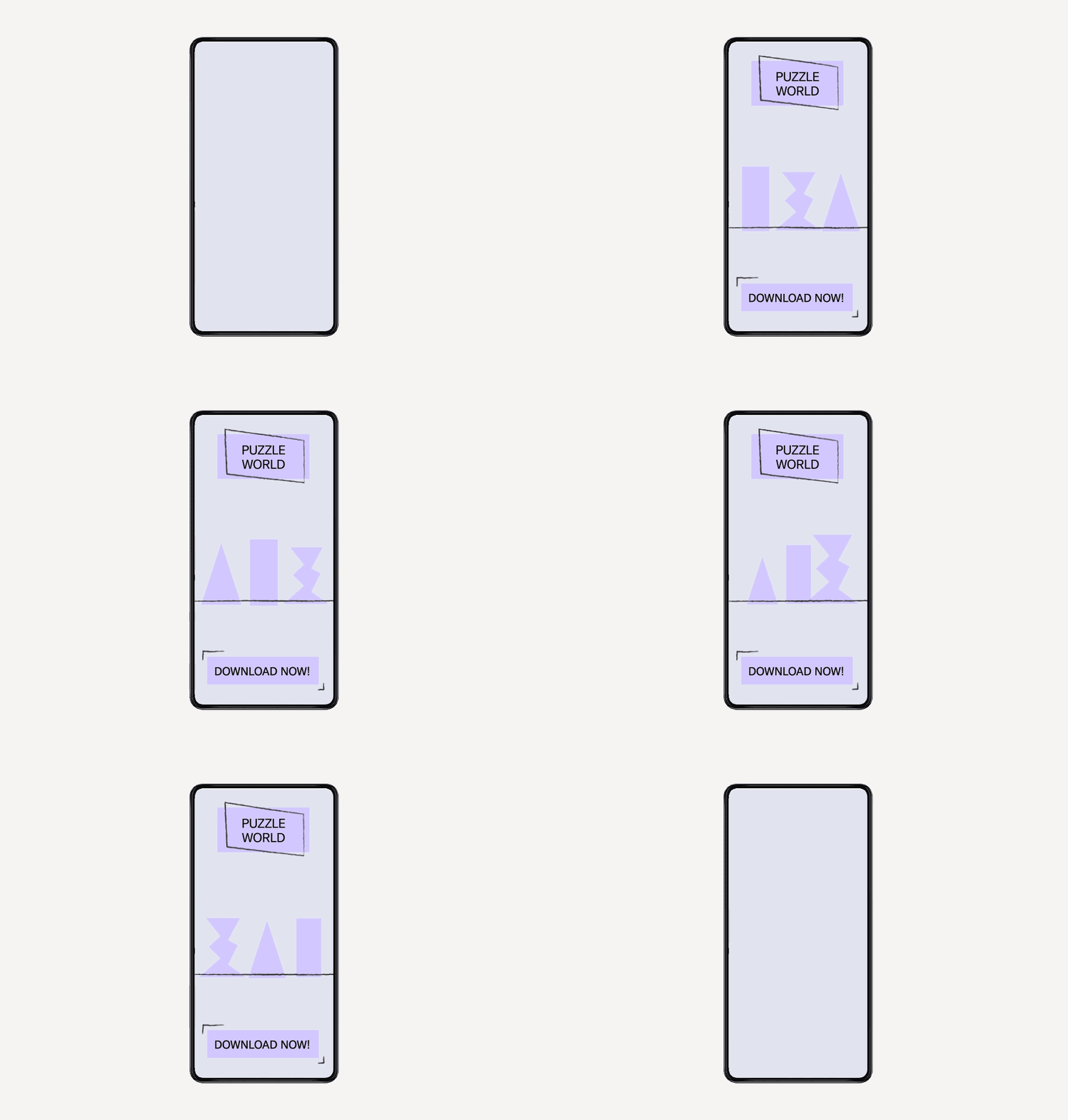
Regardless of user flow complexity, designers must include a clear CTA button on screen at all times throughout the experience when running user acquisition campaigns. When the primary objective is user acquisition, app marketers must always present the user with the option to tap through to install.
Some tips to keep in mind when designing ads specifically for user acquisition include:
- Consider orientations and layout responsiveness for all screen sizes.
- Use looping ambient animations to draw attention to the CTA. Vibrant colors and large, juicy buttons are always important when approaching design.
- Make an impact from the onset of the ad experience. Along with concise copy, use emphatic animations, audio feedback/haptic vibrations for user interactivity, and iconography to provide clear instructions for the user.
« We must now balance privacy requirements from platforms with the best-performing functionalities when presenting solutions to clients. »
Brian Janelli, AdColony - a Digital Turbine Company
Find out what leads users to tap on an ad
It’s very important to know the granular engagements that the user is tapping on throughout the ad experience. This knowledge helps to develop best practices around where user dropoff is, establish functionality benchmarks, and create frameworks that enable marketers to tailor creative executions for a specific campaign objective.
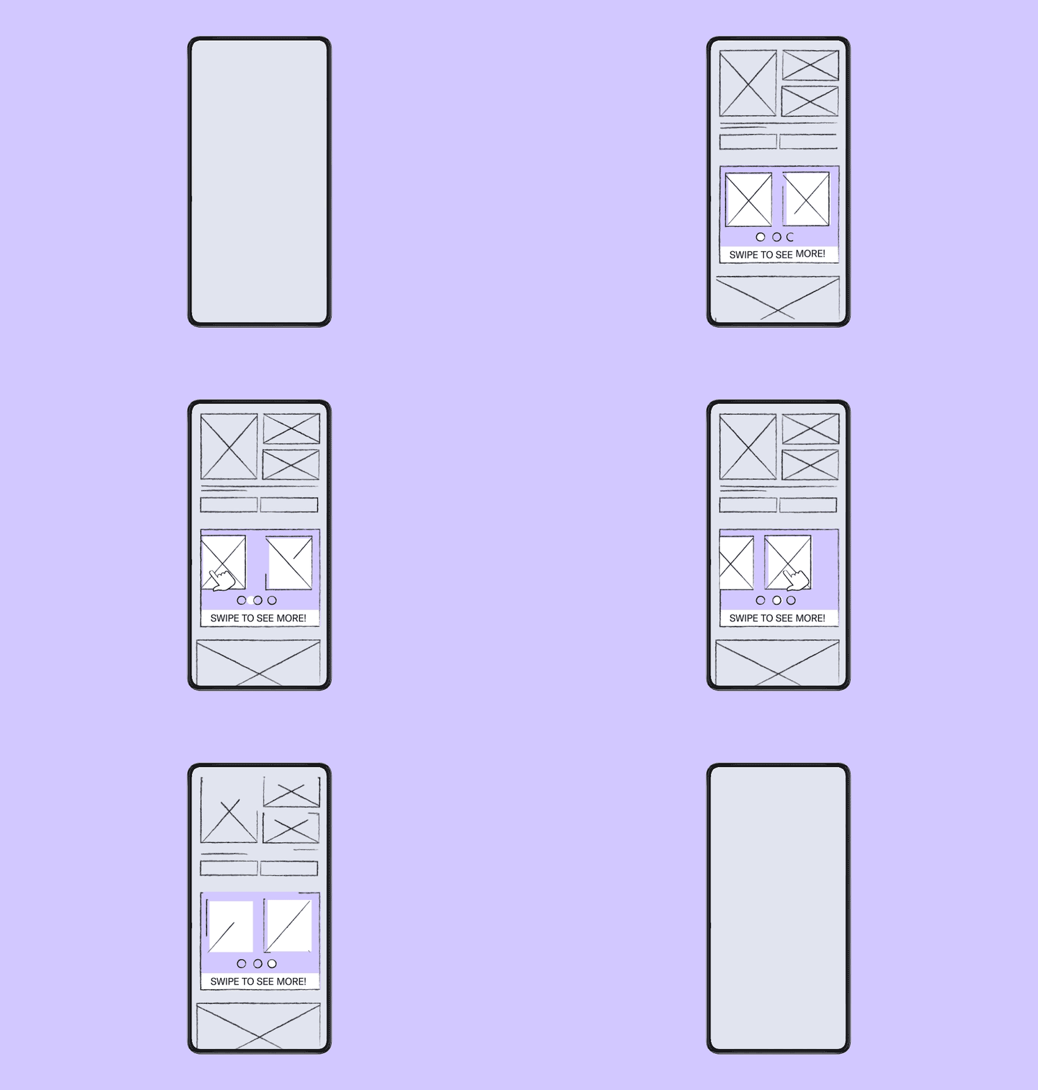
At AdColony we’ve seen better user engagement when utilizing a swipe action for navigation rather than using buttons when testing creatives. This is because users are more likely to feel they’re going to be redirected out of the ad experience when clicking on a button. Through various A/B tests, we’ve also found that an ad presenting the user with an instruction screen on how to engage usually performs better than an ad that doesn’t. Concise, direct language within the instructions translates to better engagement, as do instructions that have iconography to accompany the copy.

Additionally, we’ve seen that more tappable elements don’t necessarily translate to more user engagement as eventually there will be a drop-off depending on the content within the ad. When looking at different target segments for awareness campaigns, we observed that younger audiences are less likely to spend time within ad units compared to adults, who are inclined to spend more time engaging with an ad.
Balance privacy and performance
Recent privacy changes have introduced new permission protocols that dictate how users navigate mobile ad experiences. For example, it’s now more difficult to obtain permissions to access the accelerometer, which allows the user to tilt their device to play a game or view additional content. This means we must now balance privacy requirements from platforms with the best-performing functionalities when presenting solutions to clients. For playable ads, we’ve found that user acquisition metrics are higher when the user is presented with one or two interactions as opposed to a full level of interactivity.
It’s also become apparent that a generation of young mobile gamers is accustomed to making decisions in less time, so the more you can A/B test ads at scale, the better. Even if it’s just layout or the tonalities of color, you will notice that even OS developers are testing subtle elements on their app store platform to make design elements feel more native.
Download our creatives guide
Find out how you can put these insights into practice. In Make It Worth The Click we look at everything you need to know when designing your ad creatives. Get tips for writing ad copy and optimizing layouts, plus a format “cheat sheet”, which gives you a breakdown of different mobile ads and what to consider before starting design work.


